All designs are created by me
Built early mornings, one iteration at a time
© 2026 Daniel PARISI. All Rights Reserved
Overview
Overview
Overview
I redesigned Finary’s onboarding and early user experience to improve trial activation and help users better understand the value of the premium offering.
Finary is a personal finance platform that brings banking, savings and investments into a single interface, enabling users to track and optimize their financial situation in real time.
Product
Product
Product
Mobile App
Mobile App
My role
My role
My role
Research & Design
Research & Design
Timeline
Timeline
Timeline
Q4 2025 • 2-week design challenge
Q4 2025 • 2-week design challenge
Team
Team
Team
1 Product Designer (among 10 participants) Reviewed by 2 jury members
1 Product Designer (among 10 participants) Reviewed by 2 jury members
The Problem
The Problem
The Problem
With a strong product and an engaged user base, the team had already validated the core experience. However, one pattern stood out from internal data:
While most users who activated the free trial converted to paid, the majority of new users never started a trial. Despite signing up and exploring the platform, many users stayed on the free plan and never experienced the full value of the product.
To better understand this gap, the jury shared prior research and internal insights highlighting early drop-offs and low trial activation among new users.
Early signals:
Early signals:
80% Trial users converted to paid plans
80% Trial users converted to paid plans
Low activation Most new users never started a trial
Low activation Most new users never started a trial
Drop-off Users disengage before experiencing value
Drop-off Users disengage before experiencing value
Rather than a retention issue, this revealed an activation gap. Those who activated the trial saw value. Most users simply never got there.
Recognising this gap, we saw an opportunity to turn early curiosity into conviction by making value tangible from the very first interaction.
Rather than a retention issue, this revealed an activation gap. Those who activated the trial saw value. Most users simply never got there.
Recognising this gap, we saw an opportunity to turn early curiosity into conviction by making value tangible from the very first interaction.
Audit
Audit
Audit
What I learned
Curiosity was there, but conviction was missing
What I learned
Curiosity was there, but conviction was missing
What I learned
Curiosity was there, but conviction was missing
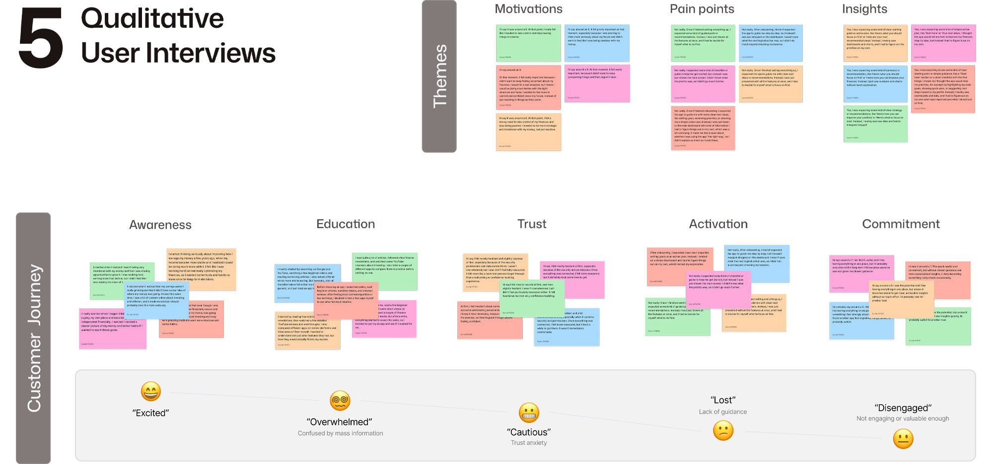
Because the challenge started with prior research shared by the jury, my role was not to rediscover the problem from scratch, but to validate and sharpen it through the product itself. Using those early signals as a foundation, I audited Finary’s onboarding and first-use experience to understand where clarity, trust, and perceived value were breaking down before users ever reached the trial.
Because the challenge started with prior research shared by the jury, my role was not to rediscover the problem from scratch, but to validate and sharpen it through the product itself. Using those early signals as a foundation, I audited Finary’s onboarding and first-use experience to understand where clarity, trust, and perceived value were breaking down before users ever reached the trial.
Major issues
Major issues
Long and demanding setup before value
Long and demanding setup before value
Long and demanding setup before value
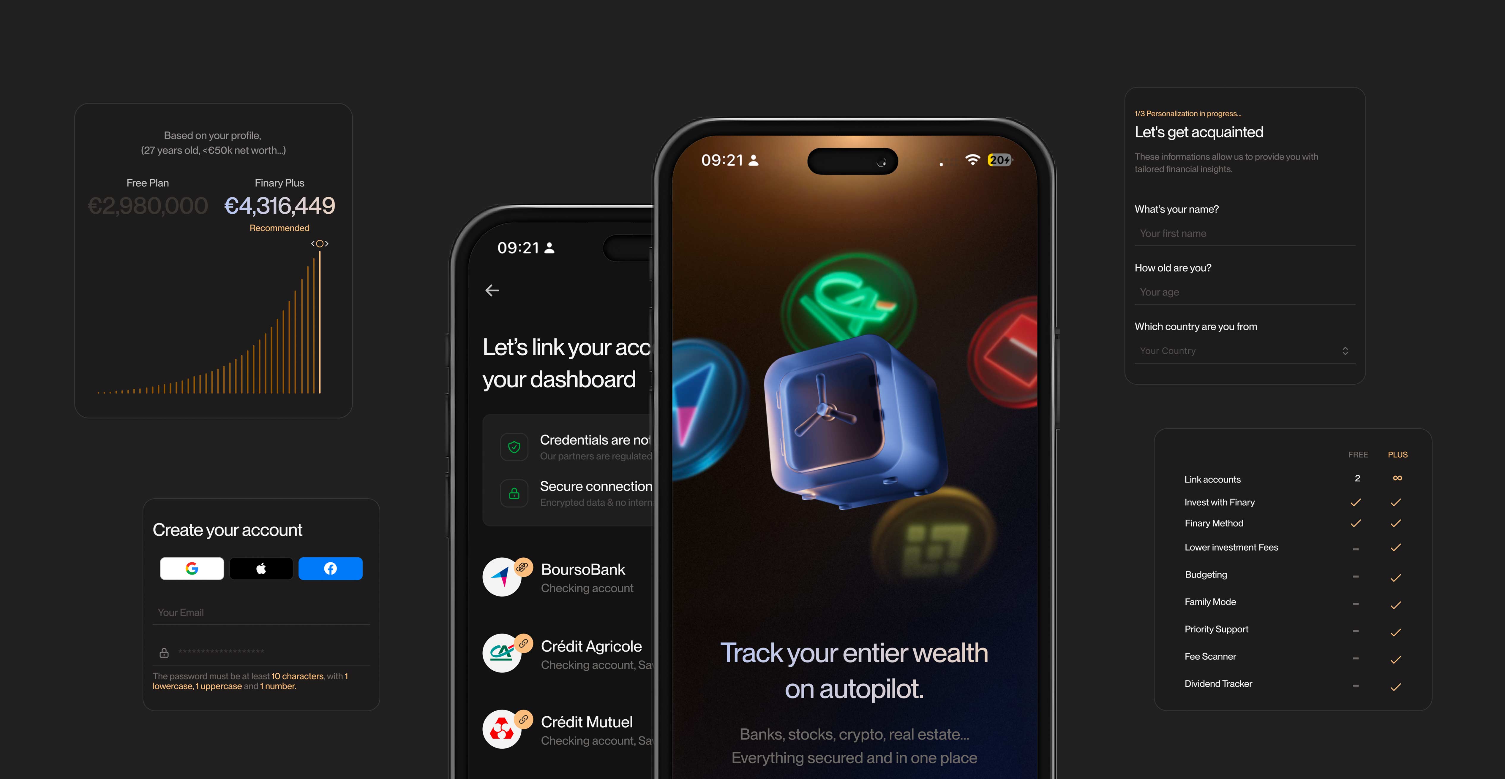
Users were asked to answer 9 questions before even creating an account, increasing the risk of early drop-off.
Users were asked to answer 9 questions before even creating an account, increasing the risk of early drop-off.
Information collected, but not leveraged
Information collected, but not leveraged
Information collected, but not leveraged
The onboarding gathered key inputs (profile, goals, financial context), but the outcome remained generic and disconnected from what users had just shared.
The onboarding gathered key inputs (profile, goals, financial context), but the outcome remained generic and disconnected from what users had just shared.
The payoff lacked impact and personalization
The payoff lacked impact and personalization
The payoff lacked impact and personalization
Key moments such as projections or insights were presented in a generic way, without explicitly linking them to the user’s inputs.
Key moments such as projections or insights were presented in a generic way, without explicitly linking them to the user’s inputs.
Solution
Solution
Solution
Solution
Curiosity was there, but conviction was missing
Solution
Curiosity was there, but conviction was missing
Solution
Curiosity was there, but conviction was missing
Instead of collecting information upfront and delaying value, the onboarding was redesigned to make financial outcomes visible, personal, and immediately meaningful.
Instead of collecting information upfront and delaying value, the onboarding was redesigned to make financial outcomes visible, personal, and immediately meaningful.
At the core:
At the core:
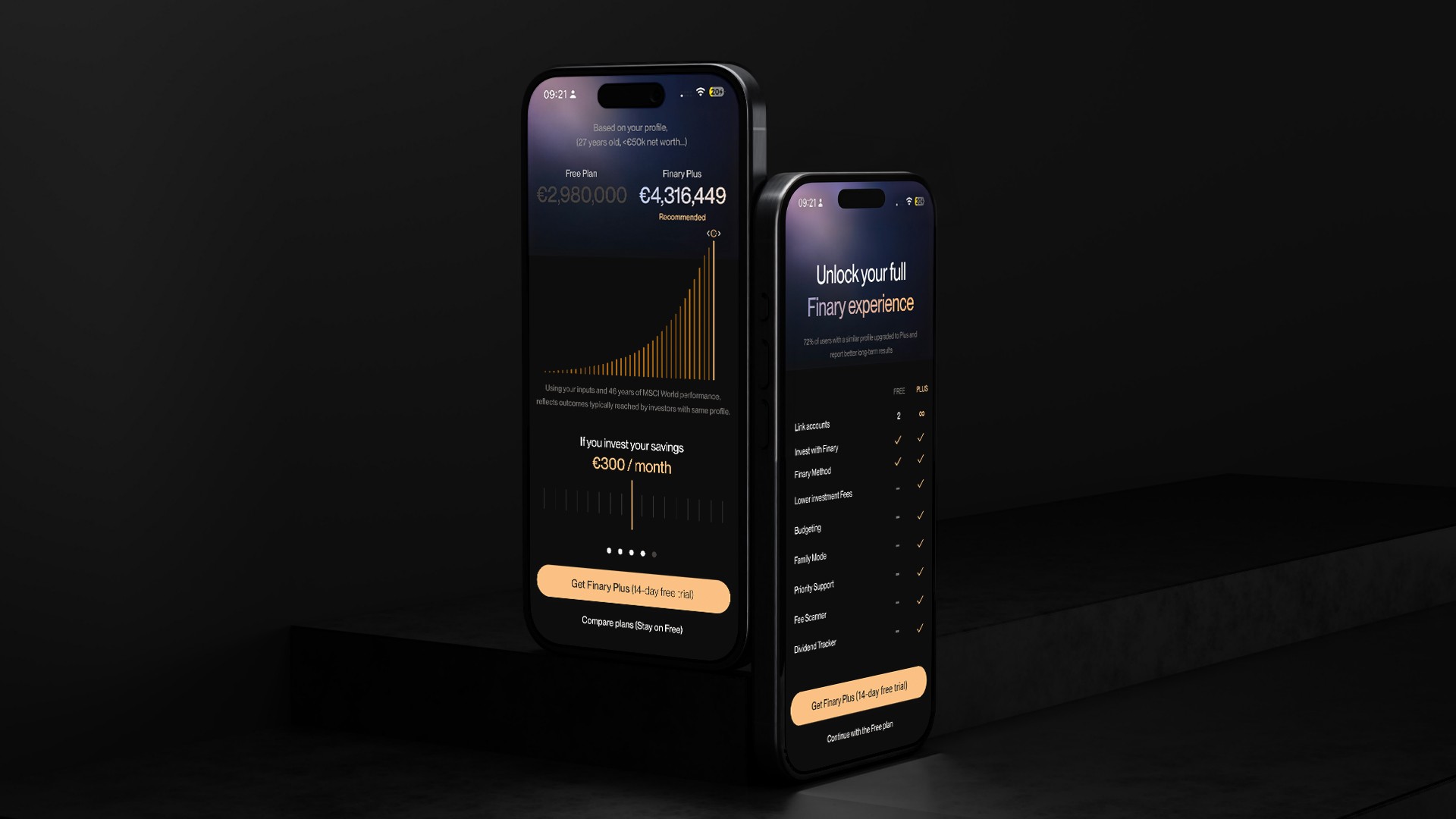
Users see how inputs shape their financial future
Users see how inputs shape their financial future
Insights are directly tied to personal context
Insights are directly tied to personal context
The difference between Free & Plus is instantly visible
The difference between Free & Plus is instantly visible
Progression
Progression
Progression
Building value progressively
Building value progressively
Building value progressively
Onboarding was restructured to feel less like a form, and more like a progression toward a clear result. Each question was designed to build toward the final projection, helping users understand how their inputs shaped their financial future. Instead of asking everything upfront, the flow creates a sense of momentum where every step feels purposeful and leads to a tangible outcome.
Onboarding was restructured to feel less like a form, and more like a progression toward a clear result. Each question was designed to build toward the final projection, helping users understand how their inputs shaped their financial future. Instead of asking everything upfront, the flow creates a sense of momentum where every step feels purposeful and leads to a tangible outcome.
Flexibility
Flexibility
Flexibility
Adapting to different decision moments
Adapting to different decision moments
Adapting to different decision moments
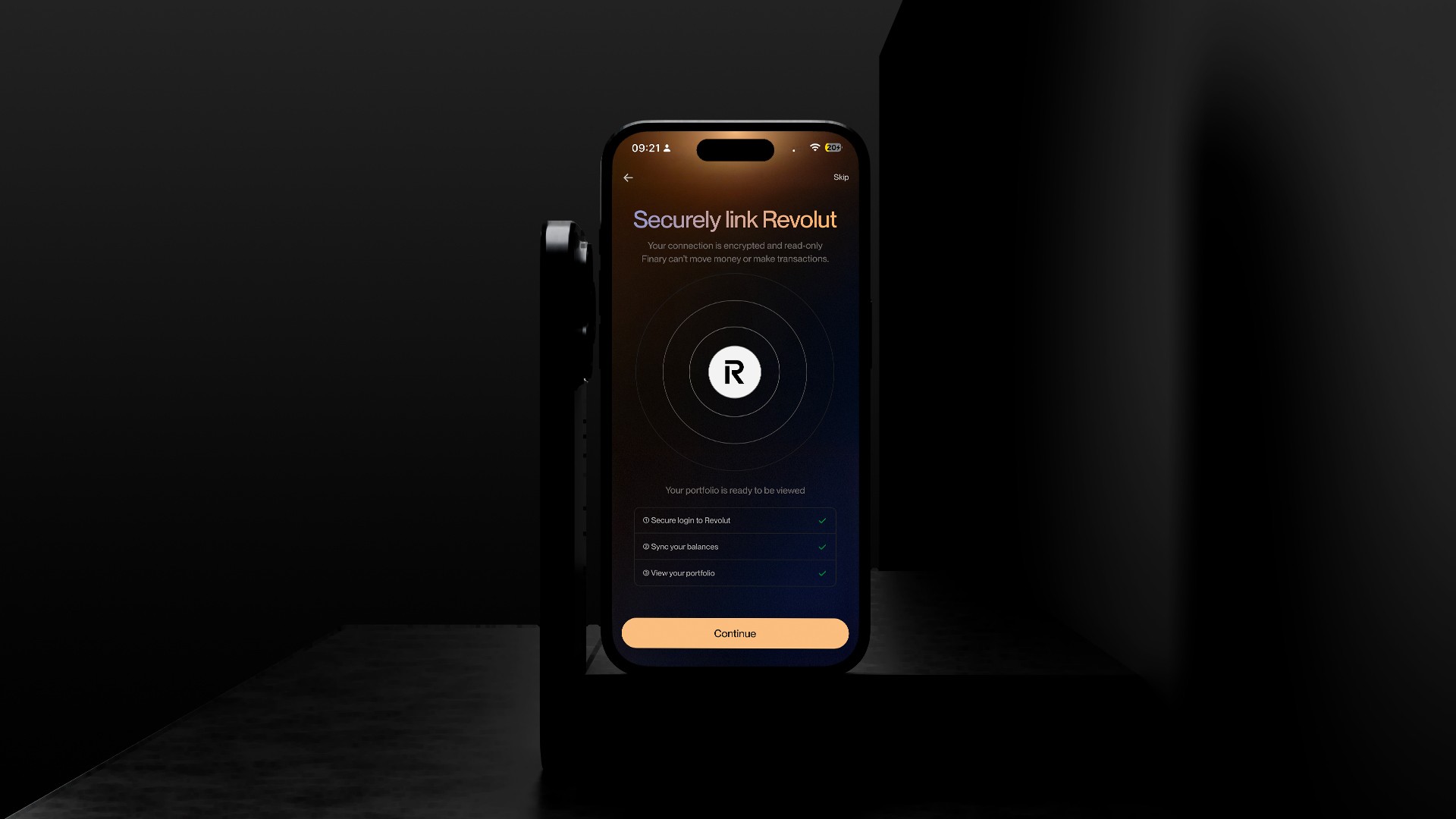
Not every user is ready to commit at the same moment. Some are convinced as soon as they see the projection. Others need more time to understand what they’re getting. Instead of forcing a single path, the experience adapts to both.
Not every user is ready to commit at the same moment. Some are convinced as soon as they see the projection. Others need more time to understand what they’re getting. Instead of forcing a single path, the experience adapts to both.
An additional layer of clarity
An additional layer of clarity
An additional layer of clarity
Users can now explore the value of Finary Plus across two complementary screens. If the projection alone isn’t enough to convince them, they can compare plans to better understand what they’re unlocking or continue on the free version without friction.
Users can now explore the value of Finary Plus across two complementary screens. If the projection alone isn’t enough to convince them, they can compare plans to better understand what they’re unlocking or continue on the free version without friction.
Results
Results
Results
Impact
Turning insights into influence
Impact
Turning insights into influence
Impact
Turning insights into influence
In just two weeks, the project focused on solving the most critical friction points in onboarding.
Ranked 3rd out of 10 designers, it was selected among the top concepts shared with Finary’s product team.
As noted by the jury:
“The quality of your problem-spotting is absolutely on point.”
Following the challenge, I connected with Head of Product Alexis Boyer, who reviewed the proposal alongside other onboarding initiatives contributing to the evolution of the current experience.
Want more?
Want more?
Want more?